Smart Living
Client Fortum
Collaborators HiQ, Futurice, Spring
Platforms iOS, Android
Date 2017-2018
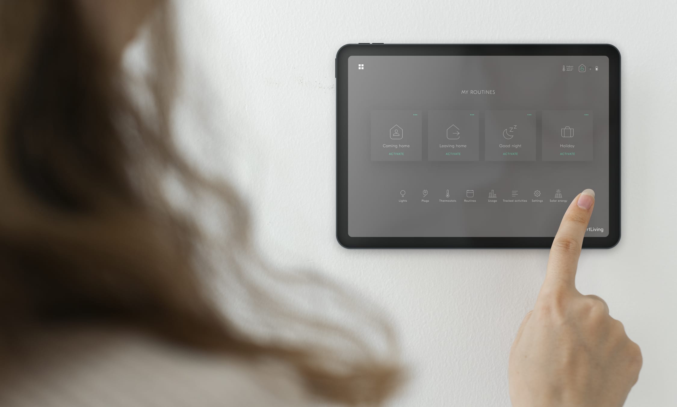
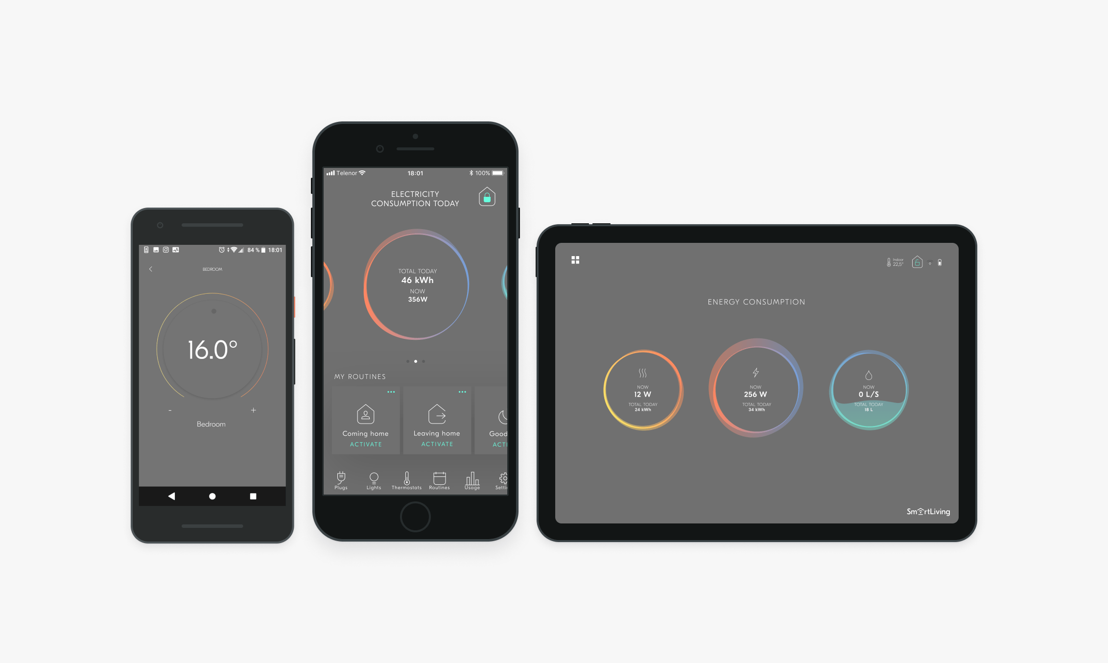
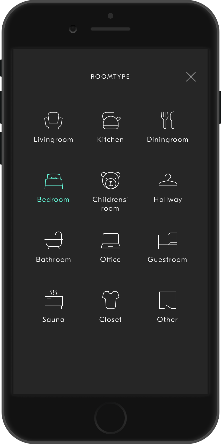
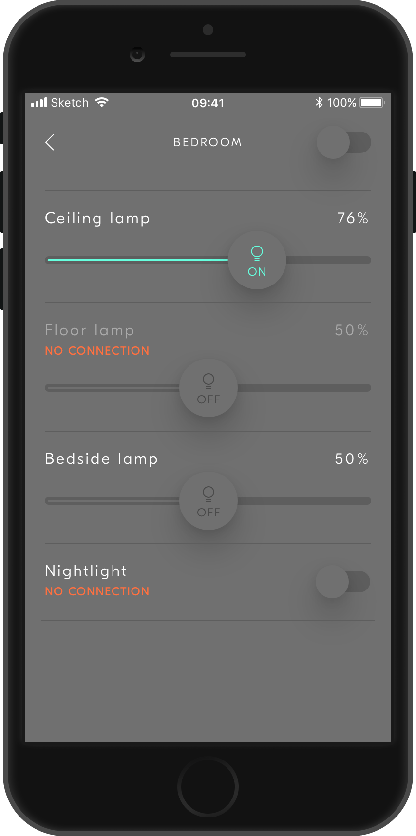
Smart homes is becoming part of our daily lives. Fortum wanted a smart home app with a clear and understandable interface, accessible to all residents, young and old. The app needed to work on smartphones as well as a wall mounted tablet, located in the hallway of the apartment.
My role
I was part of a design team consisting of UX designers and UI/visual designers. I collaborated with two other designers on the overall visual design system - UI, icons and prototypes as well as early concept design and wireframes. The app launched early 2018.
I was part of a design team consisting of UX designers and UI/visual designers. I collaborated with two other designers on the overall visual design system - UI, icons and prototypes as well as early concept design and wireframes. The app launched early 2018.
The challenge
The challenge we were facing was making an app that is both visually appealing yet non intrusive in your home setting (tablet app in particular).


The design process
We had numerous workshops to identify the use cases using personas. The UX team also performed qualitative interviews as well as quantitative which provided great insights that really helped in our process.
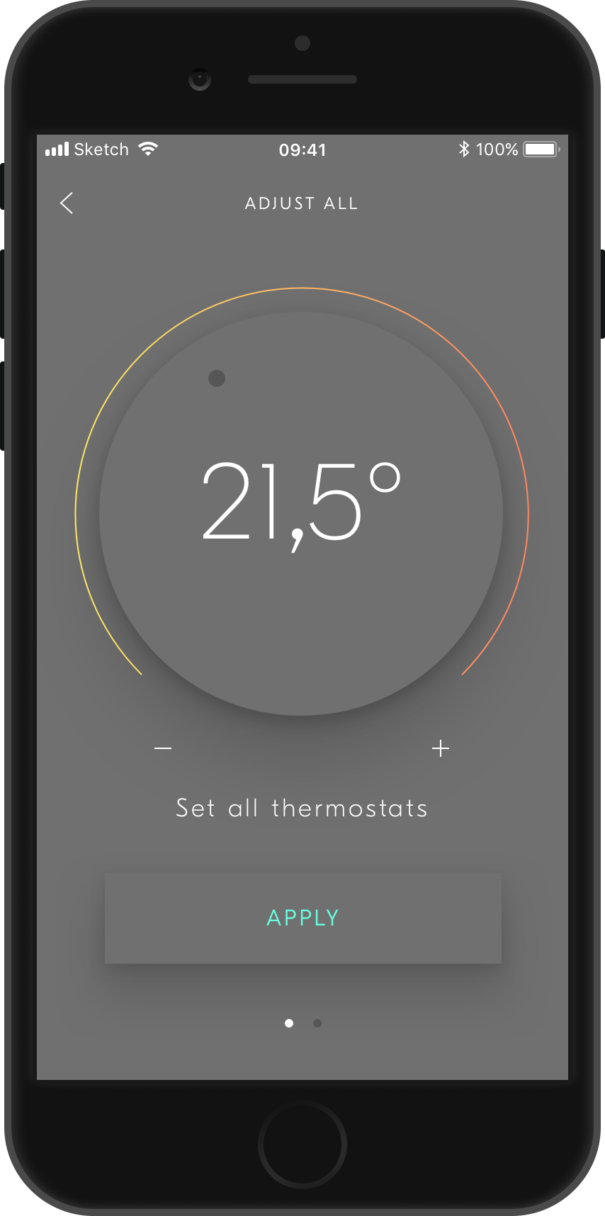
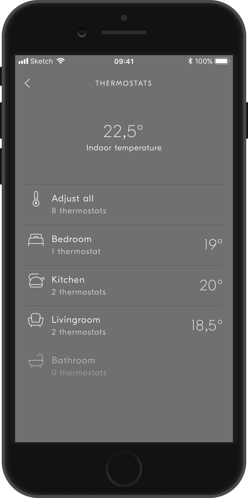
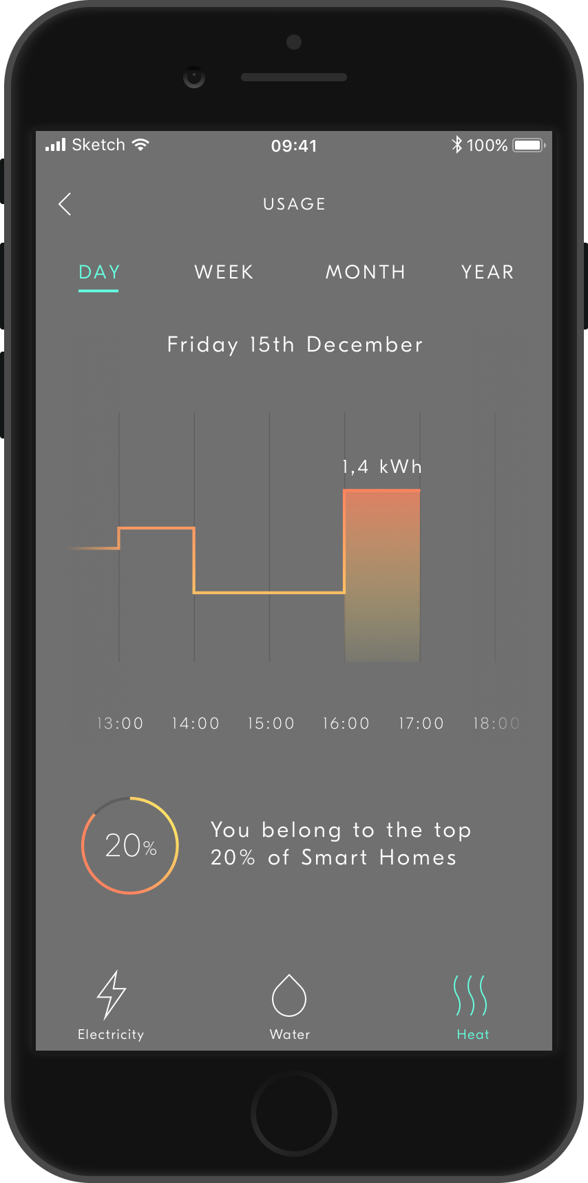
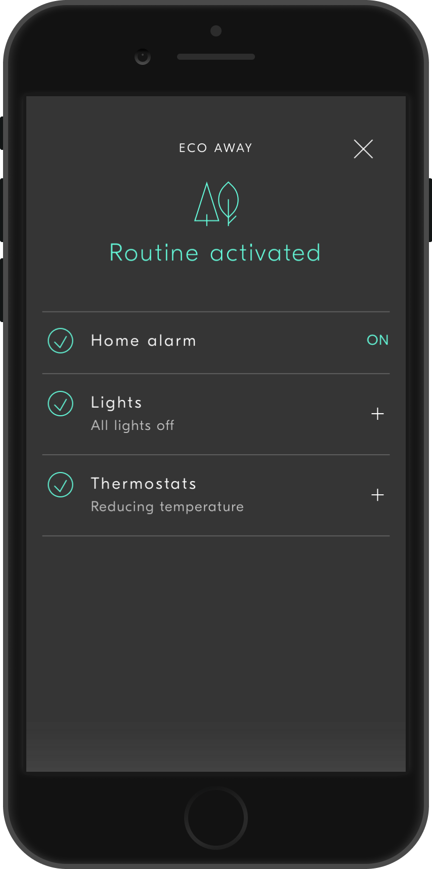
In order to make the app as non intrusive as possible (and to keep down electricity consumption), we decided on a grey base colour. We wanted to make a really calm interface, similar to a home appliance that’s just ‘there’. Using colours mostly to highlight states and going full colour when needed (such as alarm alerts).
As the design started to take form, we started making hi-fidelity prototypes that we tested on both interviewees and on random people on the street. This was a great way to get honest feedback on both usability and design and really helped us evolve the product.